
Shirts By Mike
Improving an existing
e-commerce website
This was the first case study for my Treehouse Ux course. The assignment was to critique shirtsbymike.com, an e-commerce website that sells t-shirts. Shirtsbymike.com wanted to know if anything should be changed to make the site look and/or function better for their customers. The work included updates to the brand personality, color, and type. The end result was a new website.
-Roberto Jiang, Marketing Director of Shirts by Mike
"We are unable to highlight a featured t-shirt."
"Our website is dated. Feel free to refresh the branding, if needed."
"The content looks stale; we want to keep it fresh with various campaigns."
Treehouse students want t-shirts that are fun and make them feel connected to the community, but shirtsbymike.com is dated and their content is stale.
Target Audience

Techie Traci
27 years old
Bio
Traci is a self-taught freelance writer and illustrator. Traci recently moved to Austin, Texas. Ad revenue from her new blog, along with her freelancing gigs earns her a decent 43k a year.
Behaviors
Traci is creative and playful. She is known for using the local park as her office. She spends her free time challenging herself with new online courses or helping her Treehouse classmates.
-
Mostly ages 16-35
-
Primarily based in the United States
-
Treehouse students
-
Lifelong learners
-
Values community
-
Playful
Frustrations
Everyone loves it when things just work, Traci does too. Her busy schedule allows no time for poorly functioning websites that leave her wondering about the quality of the product or the security of her personal info.
needs/goals
Traci wants to learn more about web development. She hopes what she learns from her Treehouse courses will help her take her blog to the next level. Long term she would love to land a job as an editor of a national publication. In the meantime, she hopes to find something local, to help her really become part of her new community.

Shirts by mike
journey map
Doing
Thinking
Feeling
Comparing Products
Exploring site
-
Searching for a shirt
-
Clicking on possible shirts
-
Clicking on different types of shirts
-
Reading description
-
There aren’t very mean design options
-
I like the color options
-
I wish they had some reviews or comments
-
I’m not sure what size I need
-
Underwhelmed by design options
-
Interested after finding a color she likes
-
Hesitant from lack of reviews
-
Anxious to find the right shirt
Commit To Purchase
-
Viewing prices
-
Trying to add products to the cart
-
What payments do they accept?
-
How am I supposed to make a purchase when the cart doesn’t
-
Nervous about the security of the site
-
Annoyed the website doesn’t function
where to start?
I studied shirtsbymike.com keeping basic design principles in mind. I looked at colors, shapes, groupings, and balance and organization. With a better understanding of what I was working with it was time to check out the competition.
competitor analysis

-
Community submitted designs.
-
Wide product selection, with a focus on clothing.
-
The lack of negative space makes the main page feel crowded.
-
The contact page is hard to find.
-
Established in 2000
-
Committed to Sustainability
-
Discount landing page with timer.
-
Bright colored buttons and bold text.
-
Many categories to choose from.
-
Products are a mix of independent artists and big brands (Marvel, DC, Star Wars).
-
Simple contact page.
-
Started in 2007
-
Discount landing page.
-
Lots of featured shirts.
-
Great use of negative space.
-
Language translation feature, great for accessibility.
-
Prominent search bar and simple navigation.
-
Great information architecture.
-
Simple product pages.
-
Detailed contact page
Web Sketches
Double click for a closer look.
Mobile Sketches
Double click for a closer look.


Redesign Summary
mood Board

#2c446a
#ccc339
#efefef
#fb8501
#a5a743
Colors
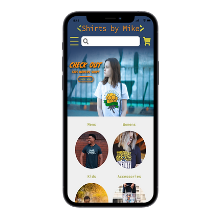
I changed the main color from the Orange Sherbet to the Catalina Blue gives the site a sense of calm and security, while allowing the other colors to keep the site light and fun. Moving the Orange Sherbet to the secondary color allows it to play the part of the “call to action’ color. According to Ashton Hauff of the CoSchedule Blog, “Orange is also known to be a color of motivation, lends a positive attitude, and general enthusiasm for life”.(www.coschedule.com)

New Logo


Featured Shirt

Filter for easier shopping
Displayed Price
Customer Reviews

New Item
Description
New color, type, and size selectors


Brand new contact page
Looks like a postcard
Reflection
This being my first case study I learned quite a bit. It started with learning the importance of empathizing with the user, and the methods used to help better understand what they need. This assignment taught me how to use basic design principles and design thinking to critique and communicate about design. I discovered the value of using sketches and wireframes as a quick way to bring my ideas to life. And to wrap it up, I learned how to use color, typography, and content to support a brand's personality.